Technical Analysis 101 – Building your first charts
Once you can interpret TA charts you will find TA becomes a lot easier to understand. The concept of charting is in itself very simple.
There are 4 main types of chart available to the technical analyst:
- Bar Charts
- Candlestick Charts
- Line Charts
- Point and Figure charts
By far in the world of trading the most commonly used are Bar Charts and Candlestick Charts.
Bar Charts – The Bar Chart is probably the most widely used type of chart. It is essentially a chart showing a snapshot of price and time for a given asset made up of many individual bars representing one period of time e.g. one day, one week etc. One period e.g. one day would be made up thus:
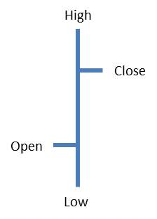
The horizontal lines represent the open and close. The open is always on the left and the close on the right. If the close finishes greater than the open then this is a positive price day and vice versa. The top of the vertical bar is the high of that period and the bottom the low of that period.
Interpretation: The main chart as a whole has two axis. The horizontal (X Axis) always represents time and the vertical (Y axis) always represents price. It is then just the case of simply plotting the individual bar data on to the chart for the one period / day specified. Once for example one days data has been plotted / completed then you move to the right to plot the next bars data. The chart plots actual trading periods i.e. Monday to Friday and are often closed at weekends and you wont see Saturday /Sunday on the chart.
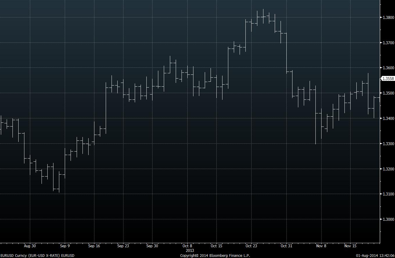
Take a look at the EURUSD currency daily bar chart below for a given period of time to visualise its construction:
Candlestick Charts – The candlestick chart resonates from 1600’s Japan and are constructed similarly to the bar chart but with some subtle differences.
These charts can appear a better visualisation tool to the TA user. In recent times this style of charting has become very popular, because of this we will look into candlestick charting in more detail in a few weeks time. But for now some basics:
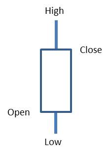
The chart keeps the four same price points like the bar chart: open, close, high, low. It is made up of a thin vertical line(s) called the “shadow” that covers the days / periods high to low and adds a thicker coloured body (called the “real body”) representing the difference between the open and the close. If the body is white then this is a positive day / period if black then negative – although in practice on charting packages you can set the up’s and down’s to any colour you like. Interpreting the patterns that an individual or group of candlesticks make is crucial to interpreting price action and can seriously aid your trading.
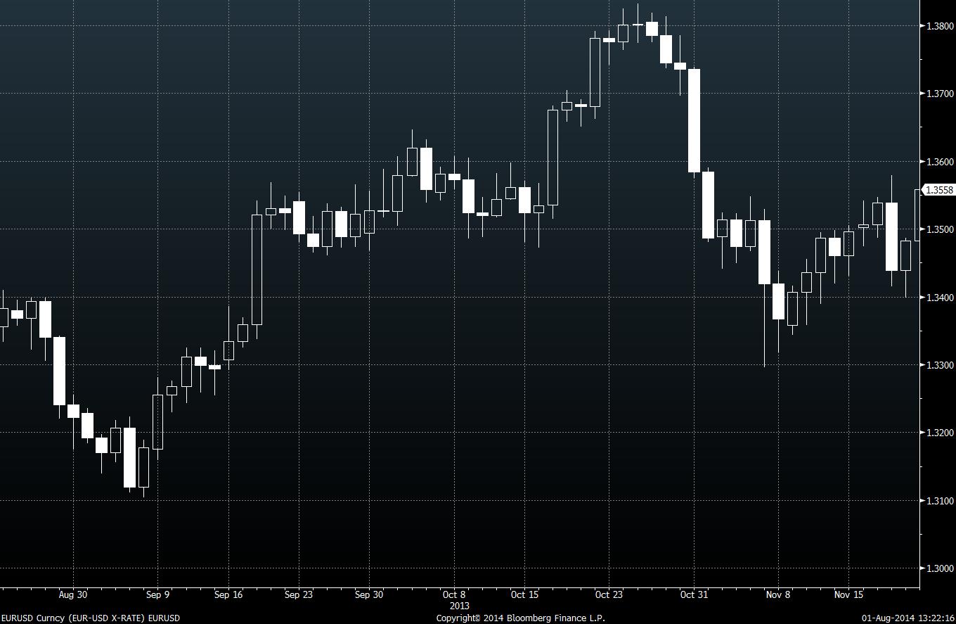
See the EURUSD chart below again, for the same time period as the other charts but in candlestick chart format:
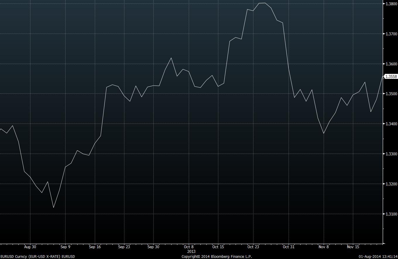
Line Charts – The line chart does away with open, high and low numbers and just reports the closing price. This one point gives a continuous line. Some users of TA believe that the closing price is the most important price of a given trading period and use only this. See the EURUSD chart below again, for the same time period as the other charts but in line chart format:
Point and Figure (P&F) Charts – A more unusual looking chart made up of “X’s” and “O’s” – the X’s showing rising prices and the O’s showing declining prices. Note how the chart is presented in columns. P&F charts are a study of pure price movement and don’t take into account time whilst plotting price. This style of charting was highly popular in the late 1800’s and early 1900’s and still popular today. The P&F charts have many advantages over the other chart styles we have looked at. We will take a more detailed look into P&F charts in the coming weeks.
See the EURUSD chart below again, for the same time period as the other charts but in P&F chart format:

Arithmetic or logarithmic charts? Charts can be viewed in both arithmetic or logarithmic price scales. In my experience most of the charting I have seen has been exclusively in arithmetic set up especially in the “futures” trading world. For very long term price analysis there could be some benefit for using a logarithmic measure. It is really down to your personal preference, thinking, understanding, trading style, strategies etc. to which version you view a chart in. One last point on this matter to give you a better idea of what I’m talking about. Log scales show an equal distance for similar percentage moves whereas arithmetic wouldn’t.
Volume – Adding volume under the price action chart can give another added useful insight into where the price could be headed. Volume is the total amount of trading activity or specified period. Volume is represented in columns under the appropriate day / period. a tall column equates to greater activity than a shorter one. Forex doesn’t show volume due to its market nuances so I have used a different chart (Gold) to illustrate volume added to a price chart. See below under Open Interest section.
Open Interest (OI) – is the total number of outstanding futures contracts held by the market participants. Because for each contract there is always a buyer and a seller, the OI on the chart is not the two added together but one side of the equation. It is normally presented below the price chart and represented by a continuous solid line in the chart.
I have used Gold to illustrate OI. See below.

Adding volume and open interest to the charts – Why add these two secondary components to your chart analysis? OI numbers are useful as they show which contracts are the most liquid. From a TA point of view you really want to be trading the most liquid assets for optimal success. OI can also give you a clue towards price momentum. Volume is similarly useful as it can also give you an insight into price and trend action.
Charts in different timeframes – you don’t just have to look at charts in a daily time frame. These are some of the more popular periods for charts: Monthly, Weekly, Daily, 240min, 60min, 30min, 15min 5min, 1min. Taking a look at a combination of charts can glean excellent information into which way the price or trend in price is possibly going to move to.
Concluding remarks: Charting is made up of three major components: Price being the major primary component and volume and open interest being secondary components. Price as we have seen can be analysed in 4 key different price styles. Charting is not rocket science and once understood can open up many opportunities for the discerning trader or analyst in financial markets.